View Project

Transforming Germany’s most trusted science show brand.

As Quarks – a well-known German scientific TV show – expanded across platforms, its look and tone started to fall apart. The content was strong, but every channel spoke a different visual language. The task was to bring everything back together in one clear system: flexible enough for every format, and simple enough to help editorial teams work better and create faster.
client

Quarks is the WDR’s well-known science and knowledge brand. It stands for evidence-based journalism that explains complex topics with precision and warmth.

services

Brand redesign & system
Website UX & UI
Sound logo & sonic identity
Logo micro-animations
Motion assets
Social media design system
Brand style guide
Rollout coordination

industry

Media

“We question assumptions, provide context, and offer solutions. That’s what Quarks stands for.”

Mustafa Benali, Head of the Quarks Digital

The Challenge

Once a TV format, Quarks became a multi-platform content distributor operating across TV, web, podcast, and social media, reaching millions with a mix of research, storytelling, and design.

However, the brand didn't catch up with the transition. Our task was to elevate Quarks from a TV brand to a credible, engaging cross-platform science brand.

We also saw another chance: not just to reshape how Quarks looked, but how its editorial team worked, planned, and produced stories together.

Our Solution

We began by gathering the full cast of stakeholders — editors, designers, producers — to define a shared intuition: structure for science, flow for curiosity. From there we created a vibrant but scalable design system that would convey Quarks' scientific depth while remaining entertaining across all channels.

Shaping the Visual and Sonic Identity

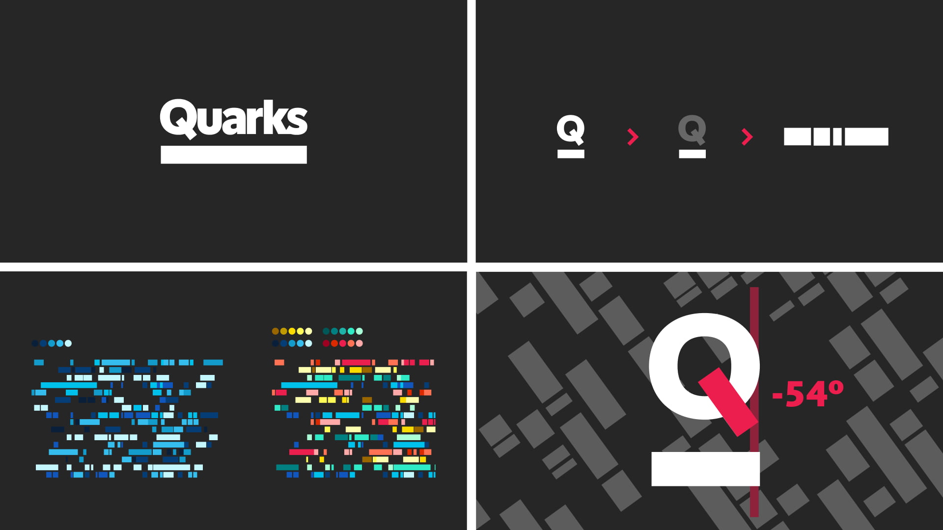
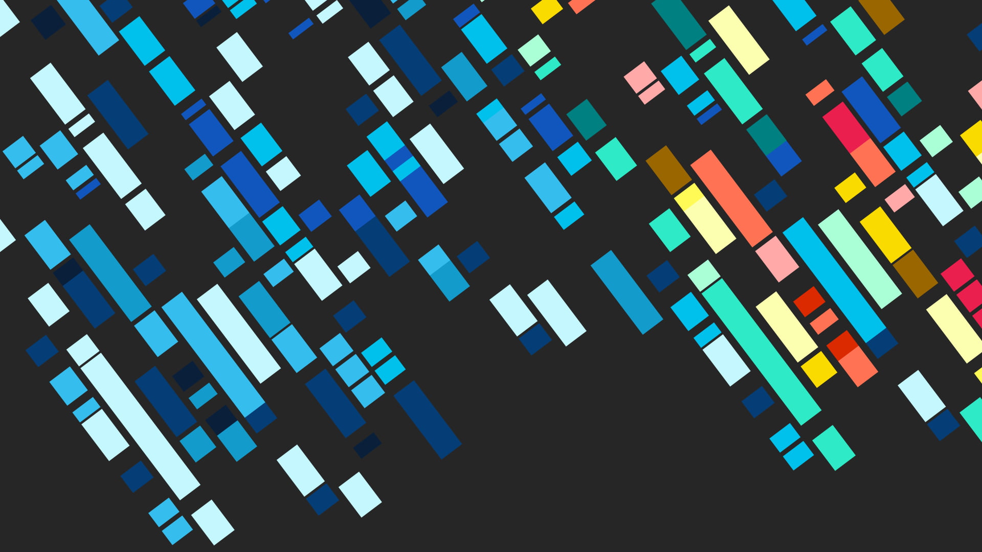
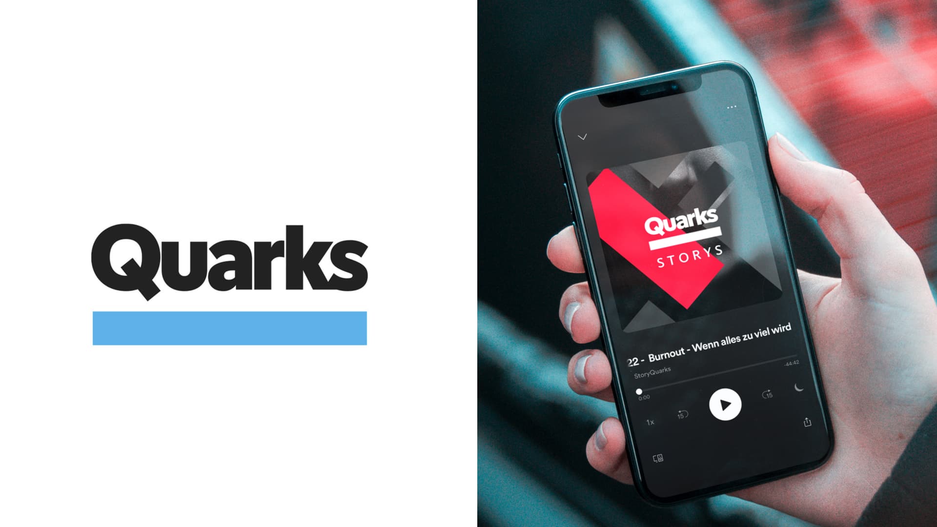
We developed a crisp visual language anchored in a modular grid, vibrant accent colors, and expressive illustrations. Alongside this, we crafted a sound logo — a brief, distinctive tone that signals Quarks across video, audio, and digital. Micro-animations on the logo and transitions reinforce consistency and simplicity in interactions.

Shaping the UX and the Web

The website became a home for all forms of content: long reads, short explainers, video, and audio. Navigation and layout were designed to make scientific depth feel effortless to explore.

Defining the Social and the Editorial System

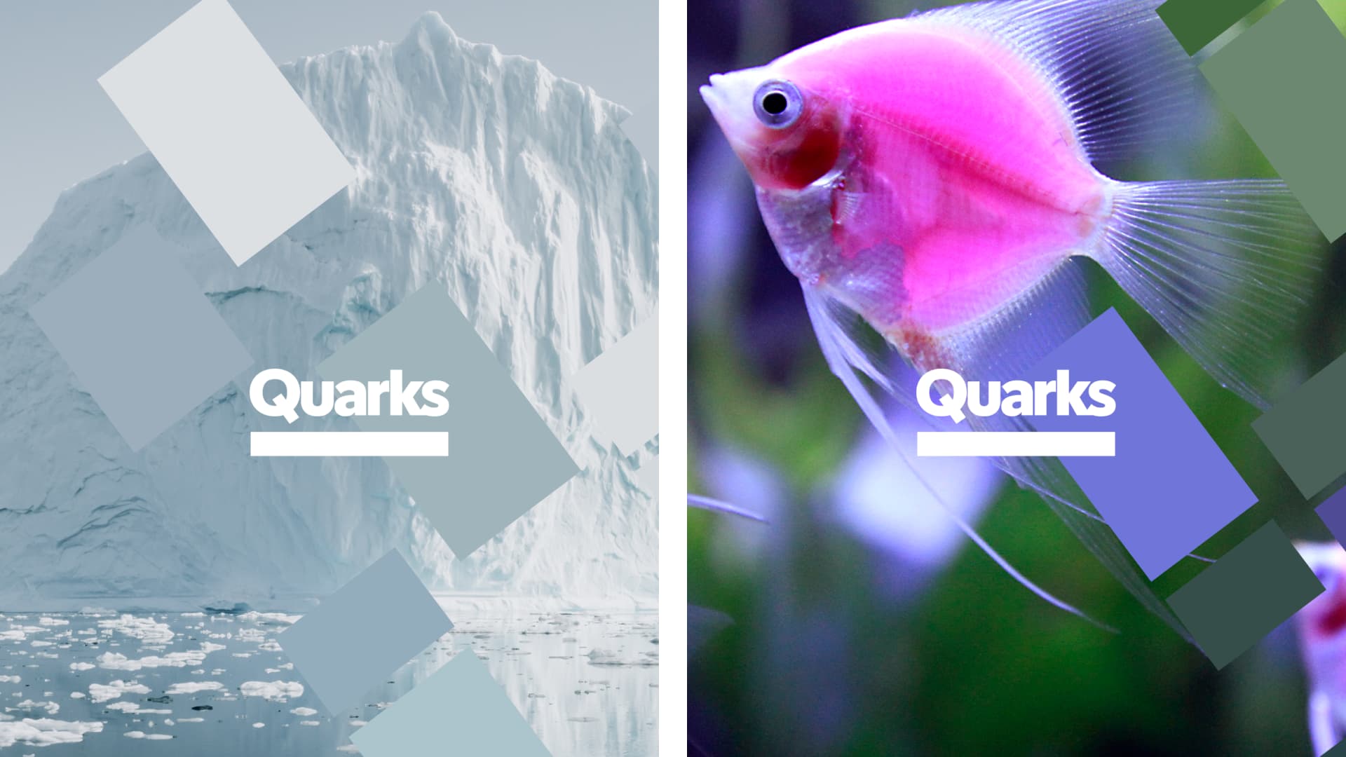
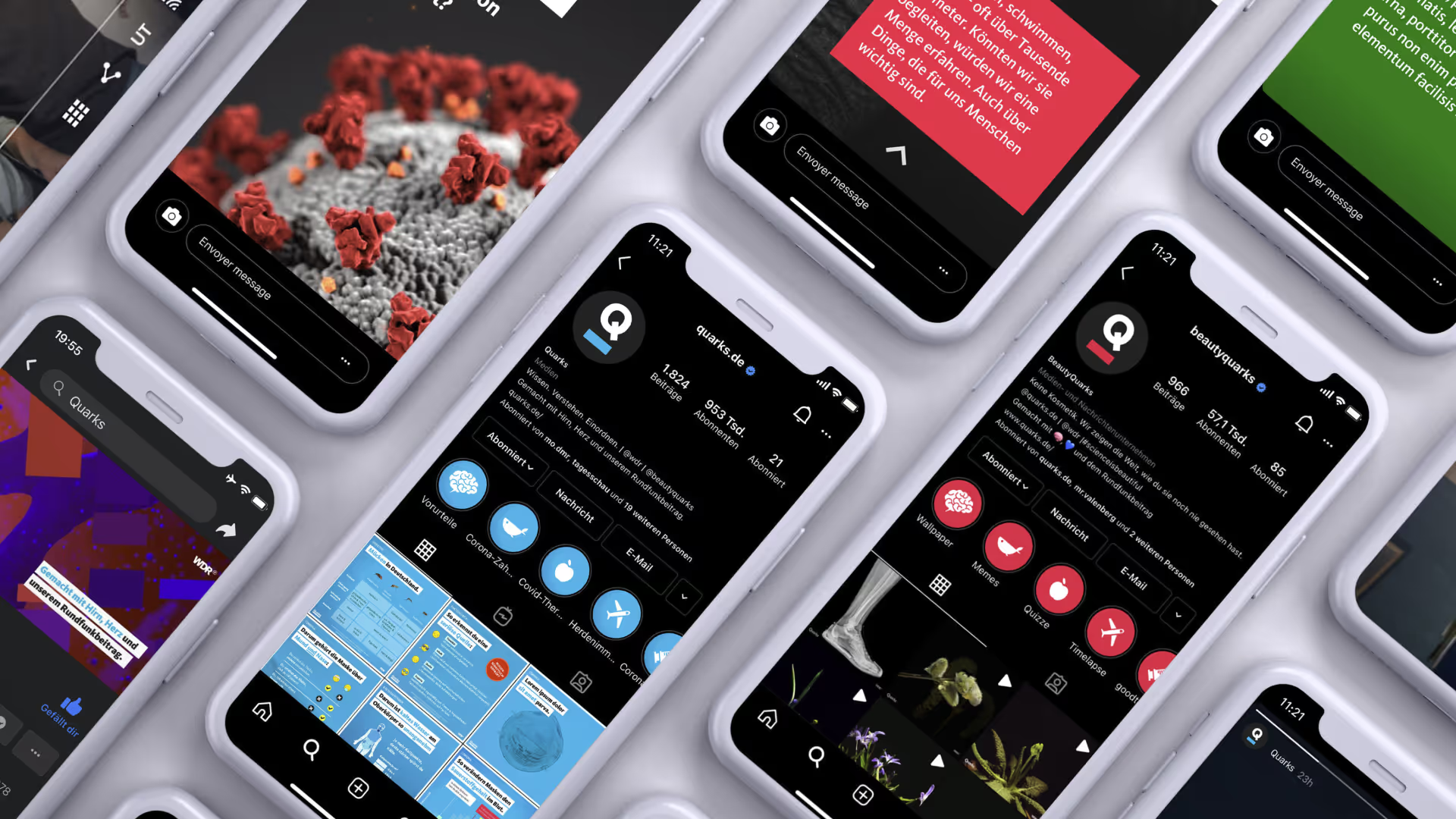
We created a comprehensive set of social templates, visual rules, and illustration assets so that the social team can publish quickly but stay within brand coherence. The design must push engagement — bold visual hooks and clarity in information.

Creating Workflow Design and Adoption

Beyond visual work, we built a toolkit and guidelines to help editorial and production teams adopt a shared visual grammar. Workshops, templates, and rollout support encouraged consistency in story design across departments — making design part of the process, not an afterthought.

The Impact

In an age of misinformation, Quarks has become a trusted reference point for evidence-based knowledge proving that clarity, design, and responsibility belong together.


The redesign gave Quarks a unified presence across formats and improved visual consistency across thousands of posts and stories:


  • At launch, the Quarks brand broke the 1-million-follower mark on Instagram.
  • Today, the channel has grown to about 2 million followers.
  • Internally, editorial alignment increased: teams now share templates and design tools, reducing friction in cross-channel publishing.

With the visual and structural foundations in place, Quarks continues to evolve. The brand now expands into new formats, collaborations, and international reach — carrying forward its mission to make science accessible on every platform.


With special thanks to:
Sami Skali (Project Lead)
Barbara Brunner (Project Management)

Previous
Next

Talk to Tanja to start solving your challenge.

→ Get in Touch