View Project

Establishing a biobank as a leader in cancer research.

Since 2002, Indivumed operated as a biobank for hospitals and cancer research. In 2024 it took a bold step toward becoming a development partner for global pharmaceutical corporations. This shift brought a brand challenge: to emerge as a visible, credible partner for companies like Merck, Roche, and Novartis, while expressing the vitality of a leading health-tech company.
client

Indivumed is a Hamburg-based precision oncology company with 240 employees worldwide. It develops new molecules (targets) in cancer cells that can be turned into drugs against cancer.

services

Qualitative user research
Brand refresh
Website design and UX
Digital asset toolkit

industry

Health

“NOCK NOCK helped shape an authentic, memorable brand - perfectly aligned with our scientific foundation.”

Kristin Maack, VP Marketing & Communications at Indivumed

The Challenge
In 2024 NOCK NOCK faced a new challenge: to translate Indivumed’s image from an “old”, research-driven organization founded in 2002 into a highly innovative global player capable of attrackting major pharmaceutical companies like Merck, Roche, or Novartis.

It quickly became clear that the hardest part was creating an attractive health-tech brand on par with the most ambitious and dynamic start-ups while remaining professional, credible, and scientifically precise.

Our Solution

We started by immersing ourselves in the expectations of global pharma decision-makers. In thorough interviews with Indivumed’s business development teams we learned how partners evaluate assets, risk, and long-term collaboration.

These insights shaped a brand experience that feels fast and progressive, while still standing up to scientific scrutiny.

Refining the Corporate Identity

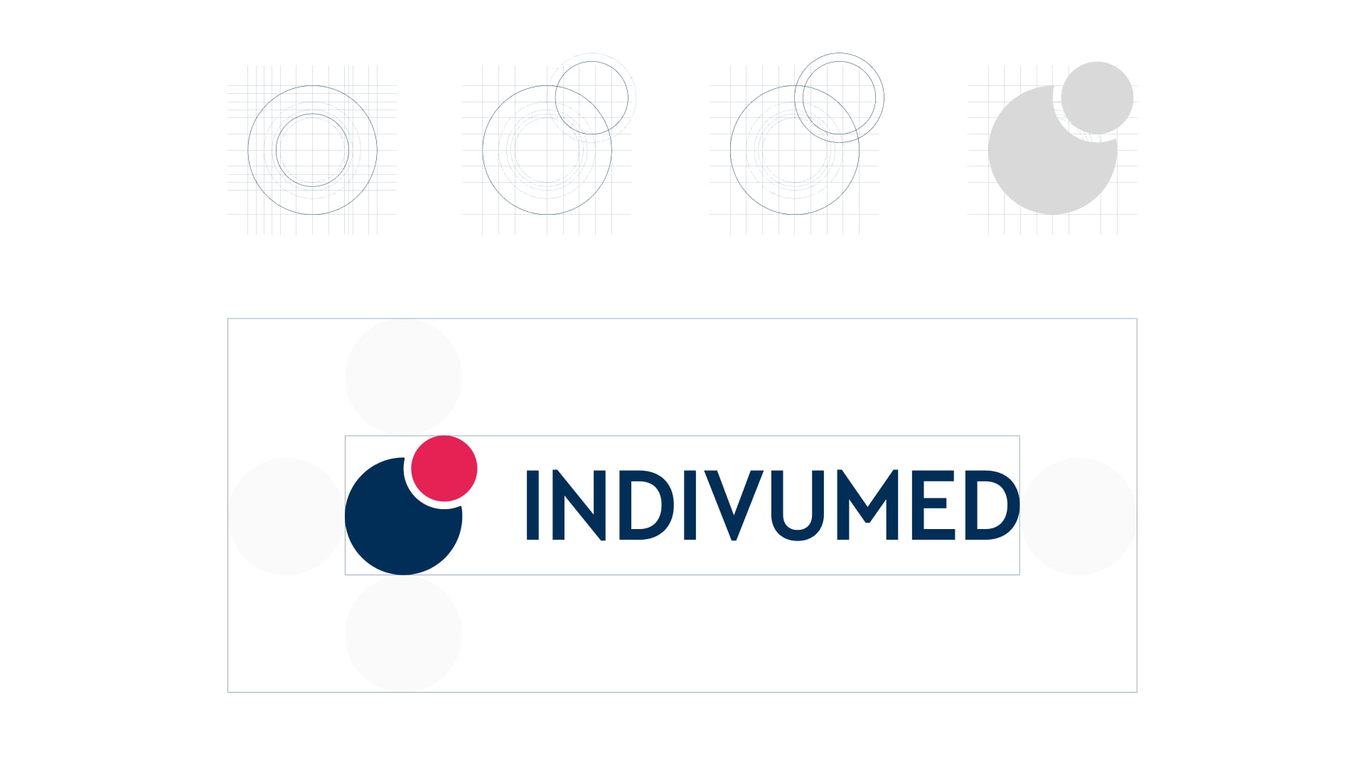
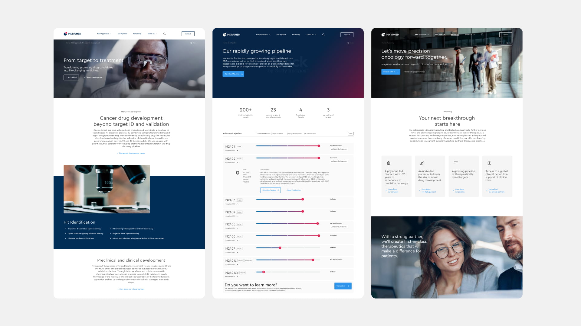
To keep most of the established scientific credibility we decided to evolve the brand rather than reinvent it. We deliberately kept recognisable elements of the existing brand, but recalibrated them to signal momentum: a brighter, more confident color palette, a contemporary type system built for digital clarity, and a carefully retouched logo that feels sharper and more decisive.

Shaping the UX and the Website

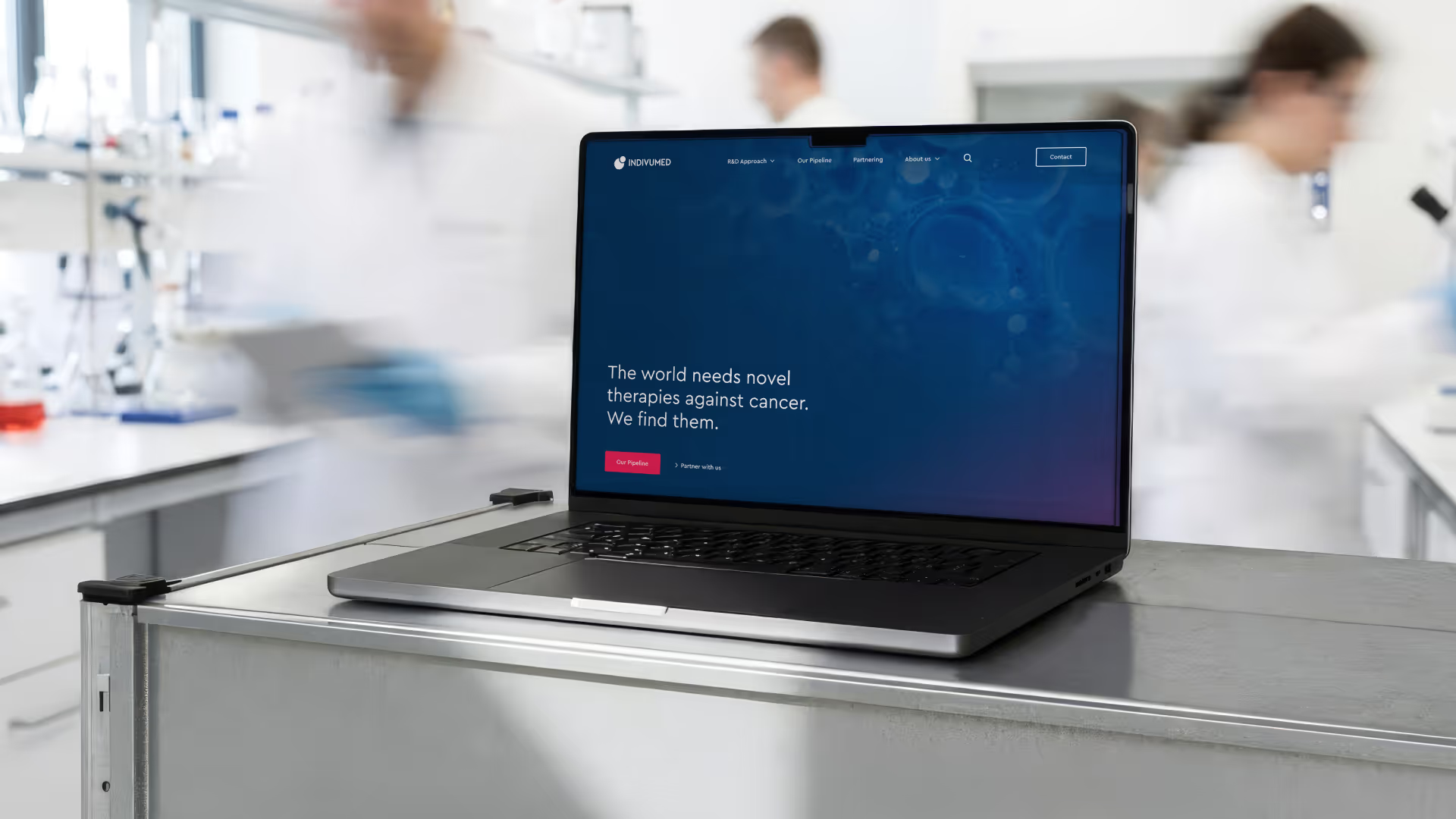
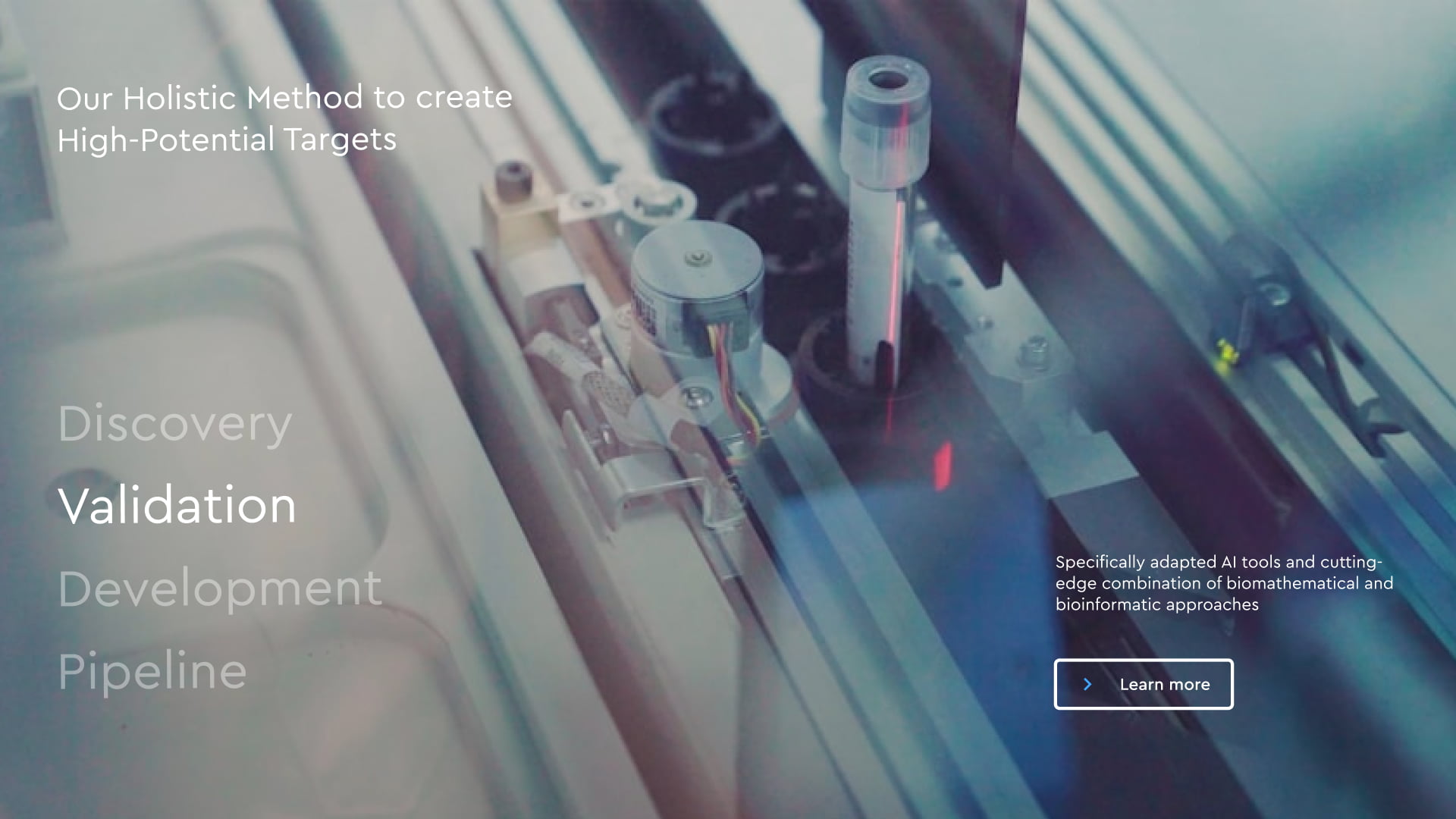
The website was restructured to match how pharma business development teams assess opportunities. Instead of leading with methods, it now starts with outcomes and relevance, then reveals scientific depth. Core questions are answered early, supported by a clear pipeline showing concrete assets and progress.

Defining a new Imagery Concept

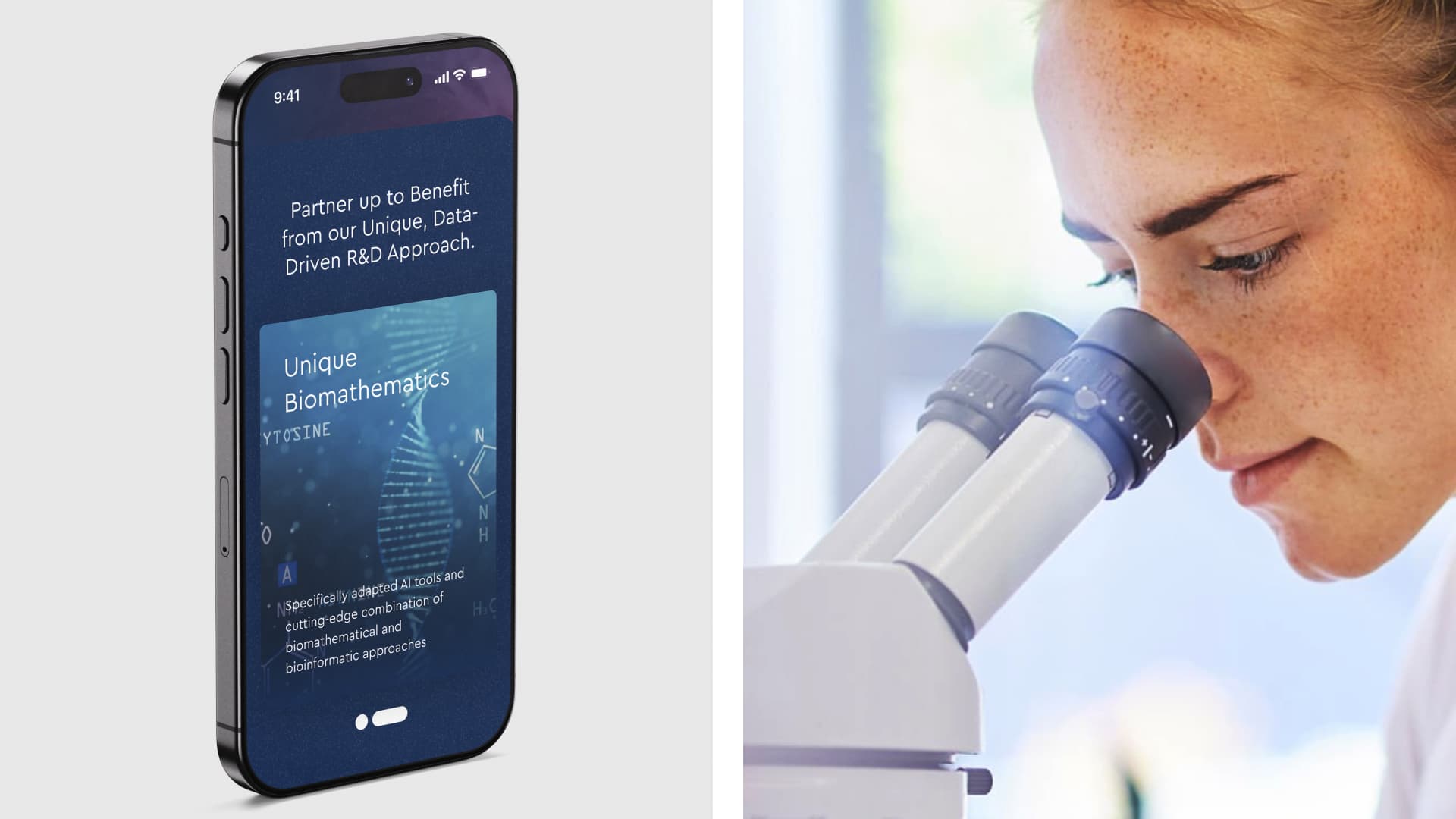
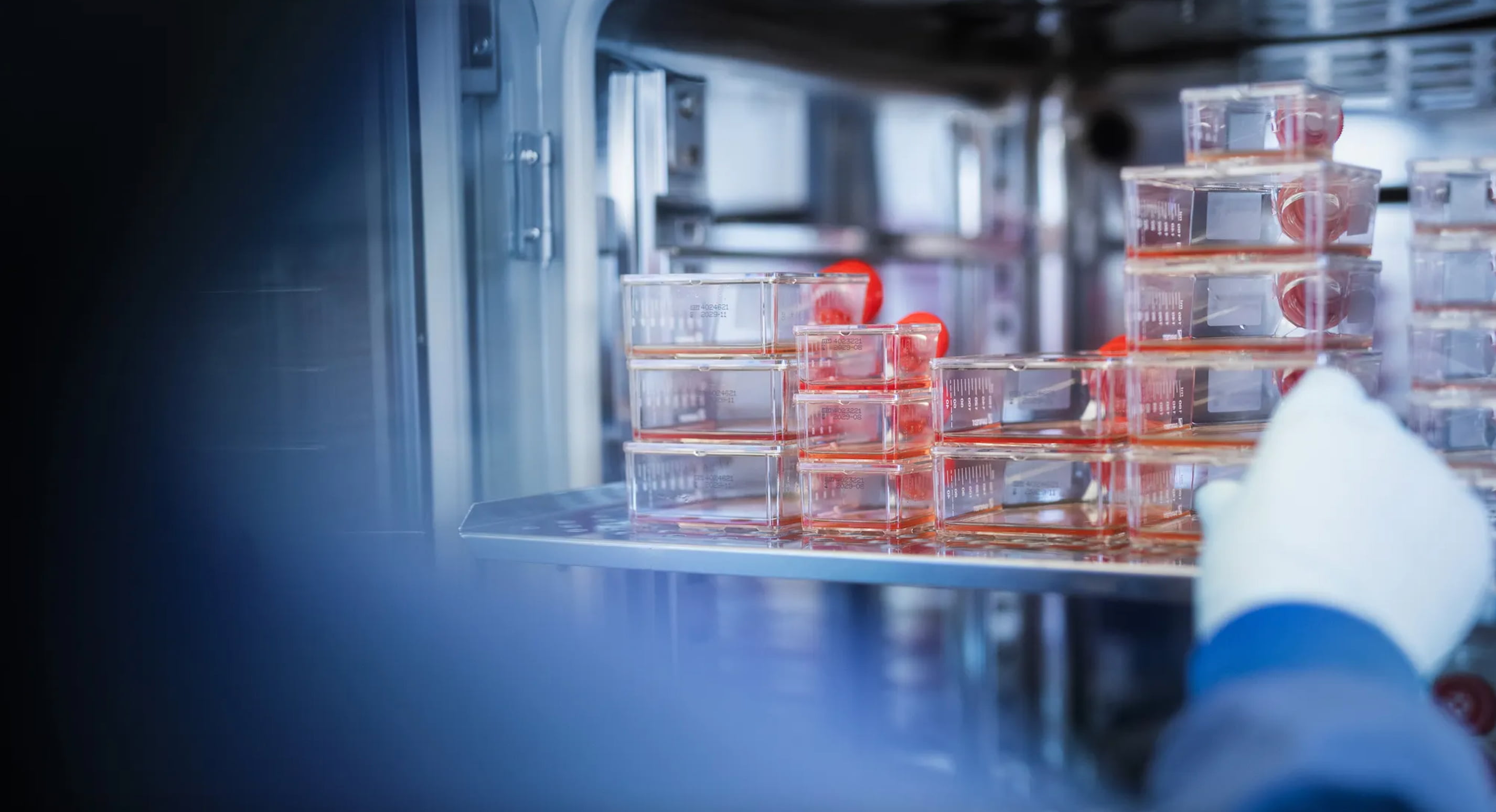
A custom image concept was developed and executed with Indivumed’s own teams. The visual language avoids generic science imagery and instead grounds the brand in real people and real work, supporting typography, usability, and credibility across devices.

The Impact

The new brand and digital presence marked a clear shift in the market. Since early 2025, the company has expanded international research partnerships, advanced a growing pipeline of novel cancer targets, and increased its visibility with pharma decision-makers.

By making its work understandable and accessible to the right partners, Indivumed accelerates what ultimately matters most: turning research into therapies that can reach patients faster.


With special thanks to:
Evi Graner (Research, UX)

Previous
Next

Talk to Tanja to start solving your challenge.

→ Get in Touch