View Project

Making mental health accessible to a new generation.

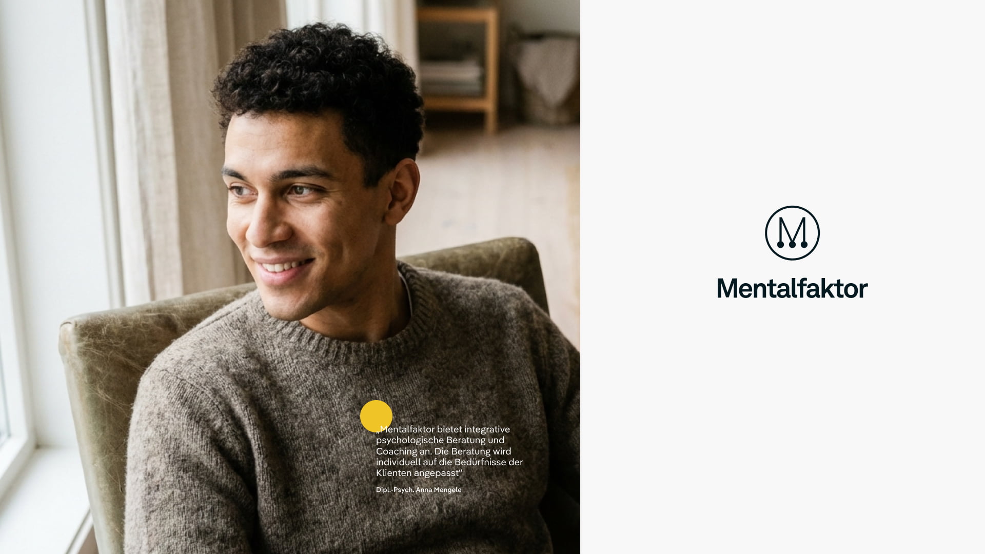
Psychological care in Germany is still trapped between long waiting lists and outdated aesthetics. The Mentalfaktor team wanted to open a third path: flexible but effective, credible but energetic, professional but human. However, the young company had no brand, no visual system, and only a few weeks before launch.

client

Mentalfaktor was founded by a team of psychotherapists to rethink support as something more personal and flexible. Not just clinical therapy, but a modular approach that can also include nutrition, movement, and everyday habits.

services

Logo
CI
Website UI
Communication Assets

industry

Health

"The team helped us turn a complex, sensitive topic into a clear and credible brand."

Stefan Beer, CEO

The Challenge
We agreed to support the Mentalfaktor team but soon faced two big questions:

1. How do you build enough trust in a new name to make people believe it before they’ve met a single therapist?

2. How do you visualise mental clarity – something invisible, deeply personal, and still taboo in many contexts?

Our Solution

We decided to speak in the language of energy, not illness.

Defining the Emotional Core

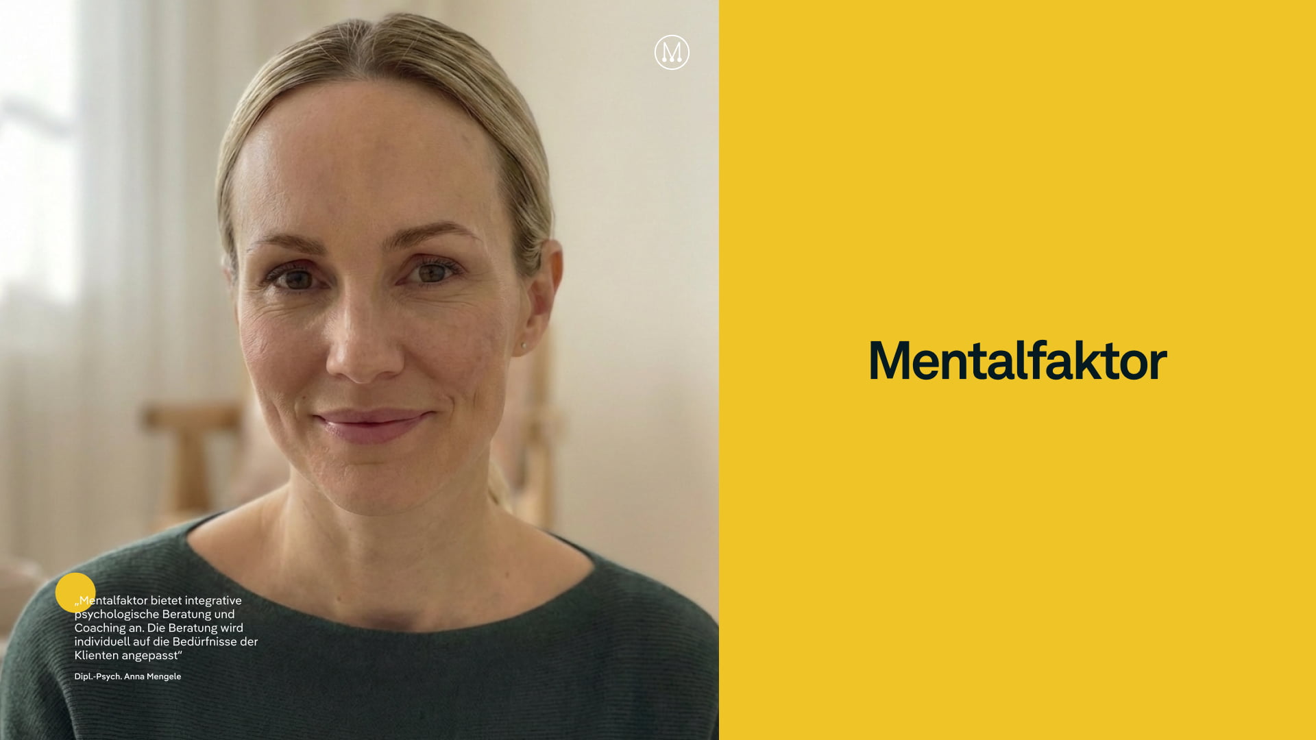
The yellow–black contrast became more than a color choice. It should become a statement: optimism meets gravity. Like light cutting through the fog.

We stripped the concept down to what mattered: clarity, contrast, and speed. The brand had to work immediately: on a poster, on a phone, in the mind.

Designing a Symbol of Balance

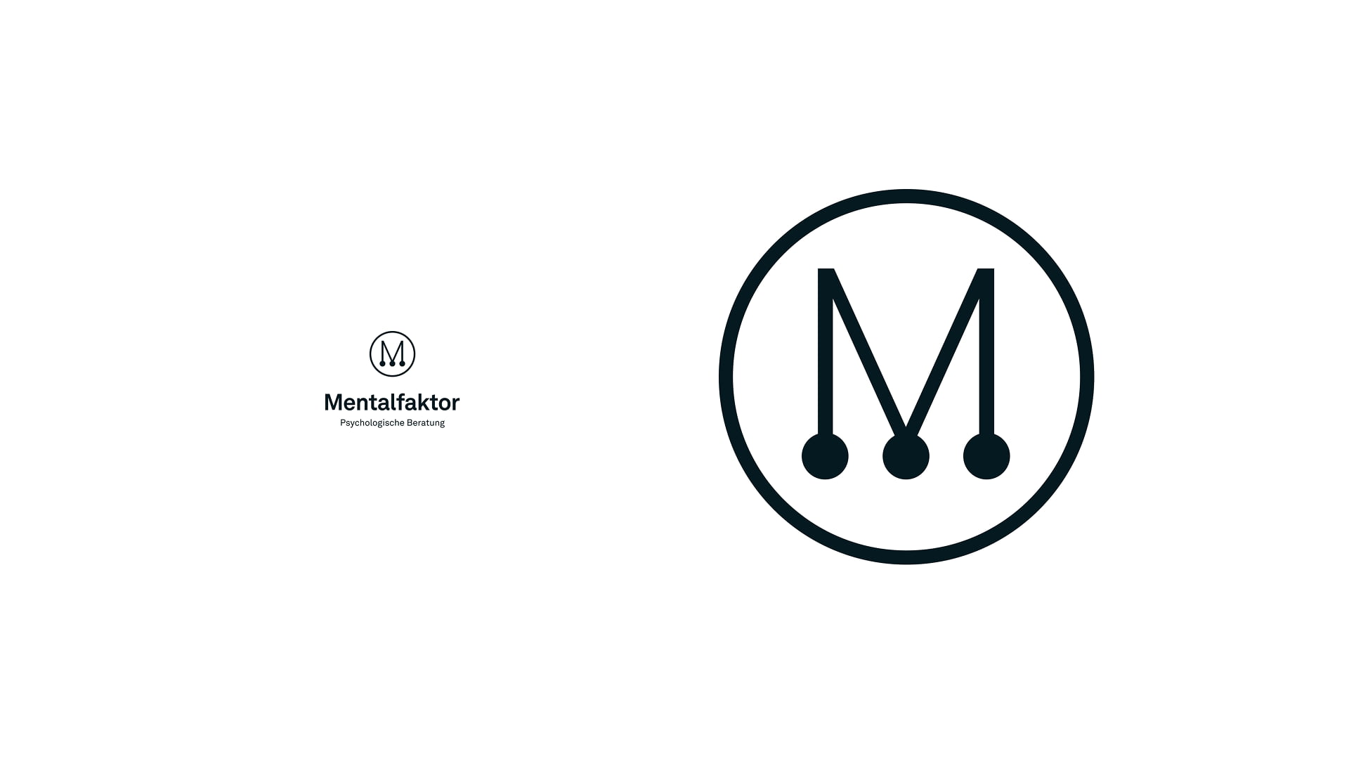
The three dots in the “M” (borrowed from Newton's Cradle) became a metaphor for how different forces in our minds interact. A small, physical reminder of inner movement.

Building a fast, functional Identity

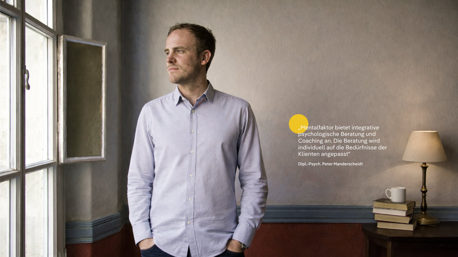
In place of a full CI system, we built what the founders truly needed: flexible templates, a visual grid, iconography, and tone-of-voice cues. Something that allowed them to start conversations while looking professional.

The Impact

Within three weeks, Mentalfaktor launched. The design gave the new brand instant credibility but not because it looked “designed,” but because it felt intentional.

It stood out in a field that often hides behind softness or jargon. And it quietly reframed how therapy could appear in the modern world: approachable, clear, and alive.

Previous
Next

Talk to Tanja to start solving your challenge.

→ Get in Touch